MOB - Run Club & Nutrition Brand

Designer: Finlay Brazier
Photography: Marko Abrams


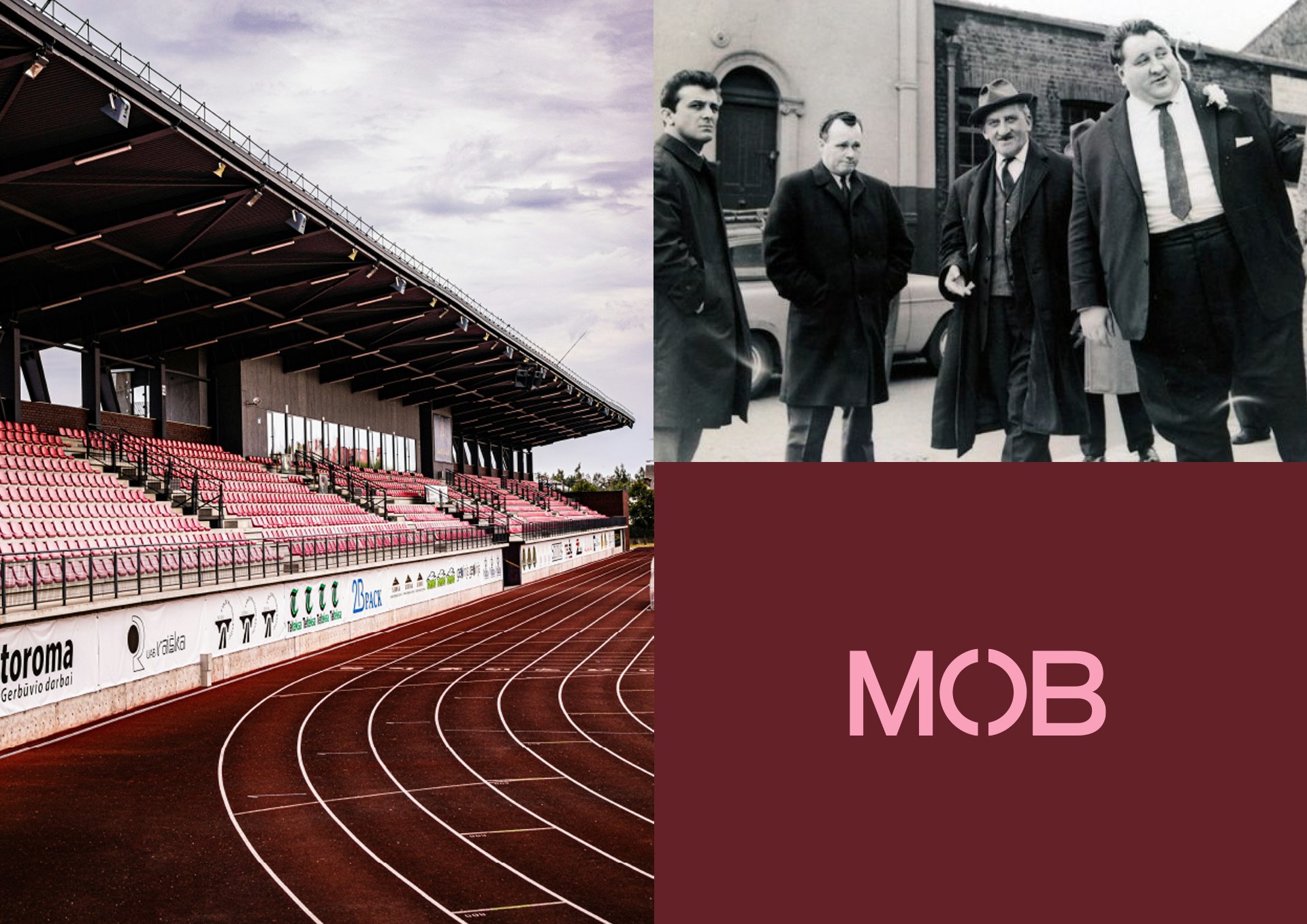
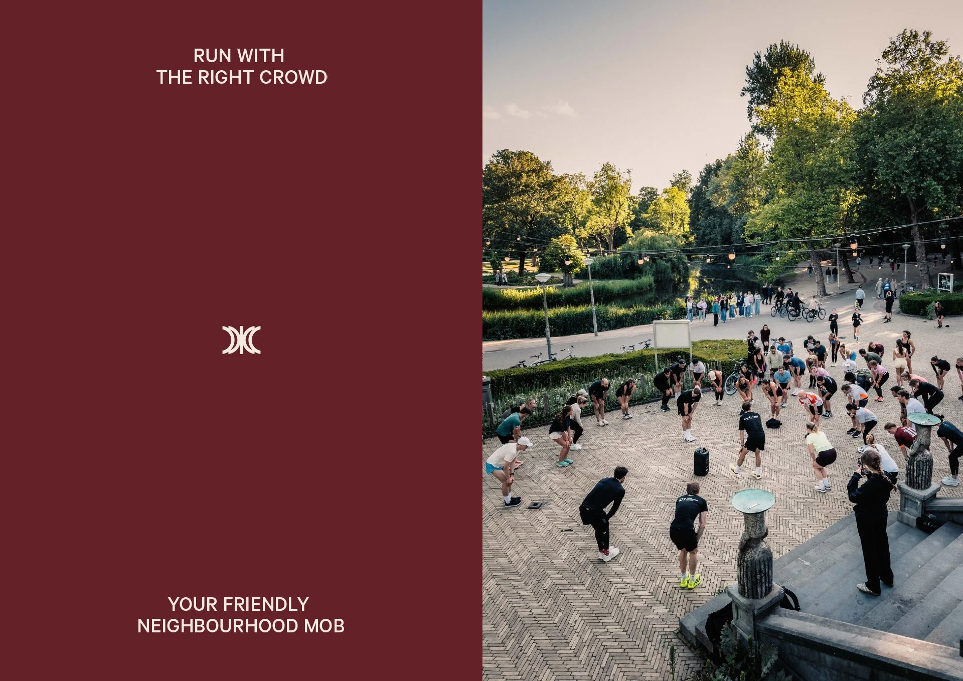
A group of founders, endless discussion, and still no name.

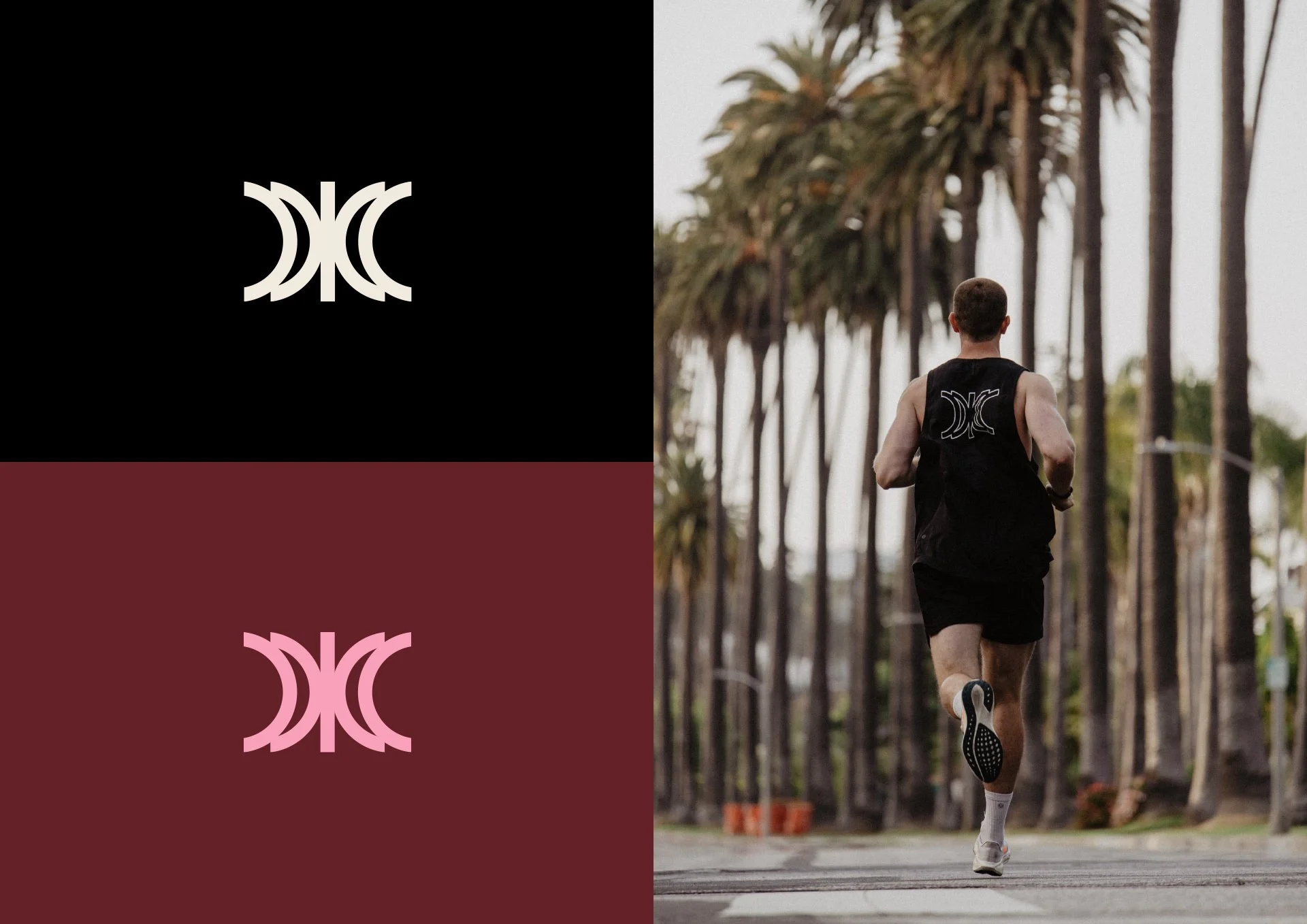
That was the situation when I started working with what is now known as MOB. The name needed to feel community-focused and balance inclusivity with performance. I pitched all sorts of names, from the expected (Rove, Pace, Locals) to the unexpected (Mosaic, Sum, Stitch). MOB was a no-brainer once it became clear that the first rule of the mob is to “Run with the right crowd.”


The “O” in the MOB wordmark is made from two brackets. The two halves form a whole, symbolising how MOB relies on its community to create an inclusive space alongside the founders. The brackets are also used to highlight the many aspects of MOB: run club, Hyrox training, nutrition, events, races and apparel.

The logo is also built from these brackets. They converge at a central point, made up of multiple elements coming together, much like the community meeting at a set location each week. You could say X marks the spot. We wanted a dynamic symbol that could one day rival that of Nike or Under Armour — something with energy and motion built in.


Red represents heightened emotion, strength and power. Studies show that a warm, vibrant red hue gives us energy to take action. Pink symbolises love, nurture and compassion. Together they reflect MOB’s focus on action, movement and community.

The concept of a “mob” can sound intimidating, so we used copywriting to balance the first impression. Lines like “Your friendly neighbourhood mob” and “Run with the right crowd” give it warmth and approachability. Others, like “Targeted hydration” and “On the run”, playfully reference the world of running while nodding to the brand’s name.


More Projects